 Magic Element | Portfolio of Dan Rodrigues
Mobile navigation UI

Missguided
Missguided is a fresh and vibrant online store that aims to stay on top of the latest trends in order to provide their customers with the best that the fashion world has to offer. Missguided’s vision is to be the world’s largest, coolest, most fun, relevant and aspirational fashion brand for millennial women. Inspired by real life, it is bold, straight talking and forward thinking.
I was hired by Missguided's in-house e-commerce team in 2013 and remained for four and a half years, based at the company's Manchester HQ, progressing from UI Designer to Senior UX Designer and contributing to their stratospheric online growth during this period.
Project
In 2017 I initiated a project which explored the way in which users interact with the site's navigation on mobile devices. This was driven by the the company's desire to offer a fun and unexpected experience for the user, without of course compromising intuitive functionality.
![]() Date: 2017
Date: 2017
![]() Role: UX/UI Research and Design · Permanent
Role: UX/UI Research and Design · Permanent
![]() Team: Ecommerce Manager (UK), Software developement team (UK)
Team: Ecommerce Manager (UK), Software developement team (UK)
The 2017 brand styles

| MG Pink | |
| #fee9e1 | #ffa5b8 |
| MG Light grey | |
| #f7f6fb | #e7e7e7 |
| MG Dark grey | |
| #404040 | #000000 |
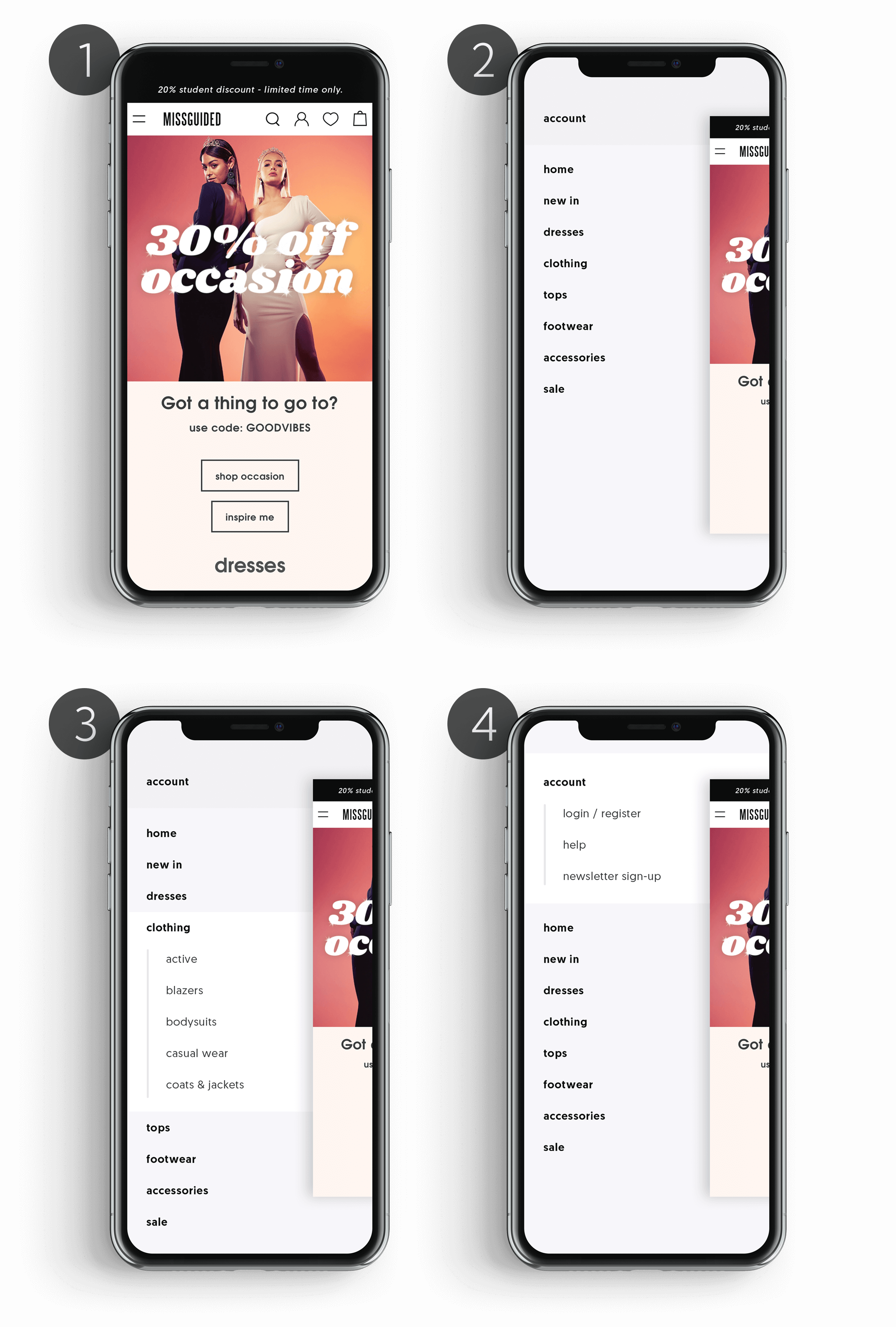
My proposal
My proposal was that when a user taps the burger menu to access the navigation, instead of the navigation sliding into view, the current page shrinks slightly and slides partially off-canvas to reveal the navigation beneath. Although this behaviour is counter-intuitive, once revealed, the navigation can be scrolled and expanded in the usual, intuitive way. Tapping anywhere on the partially off-canvas page restores it to it's original size and position, obscuring the navigation once again.
Moderated user tests
My initial idea was well received by internal stakeholders and I built several iterative prototypes of the new menu feature to test with real users in moderated user tests in Missguided's in-house UX lab. The feedback and insight gleaned from these user sessions proved invaluable and shaped the direction and outcome of the final design.
Closed card sorting
The range of products offered by Missguided is extensive and varied, therefore it was critical that the menu content structure was optimised to match our user's expectations. For this reason, the project also involved refining the taxonomy and information hierarchy within the navigation. I facilitated closed card sorting tests, both within team ideation workshops and more importantly, with Missguided's own users, to finalise the navigation menu and establish a final optimised structure.
Prototype
Here is an early prototype video demonstrating the animation which reveals the search function and then the main navigation menu.
Want to know more?
If you would like to know more about my work, or have a new opportunity you want to share with me,
please email: